


Color is one of the most powerful tools in design, capable of influencing perceptions, shaping emotions, and even driving decisions. Whether in graphic design, interior decoration, branding, or digital interfaces, the strategic use of color can create moods, evoke feelings, and communicate messages without a single word. Understanding the psychological impact of colors is essential for designers who want to create engaging and effective experiences for their audience.
Colors are inherently tied to human emotions. They can inspire joy, calmness, excitement, or urgency, depending on how they are used. For instance, warm colors like red, orange, and yellow are often associated with energy, passion, and warmth. Red can signify urgency or excitement, making it ideal for calls-to-action in web design or sale promotions in retail. Orange communicates creativity and enthusiasm, while yellow evokes happiness and positivity, often used to capture attention and generate a cheerful atmosphere.
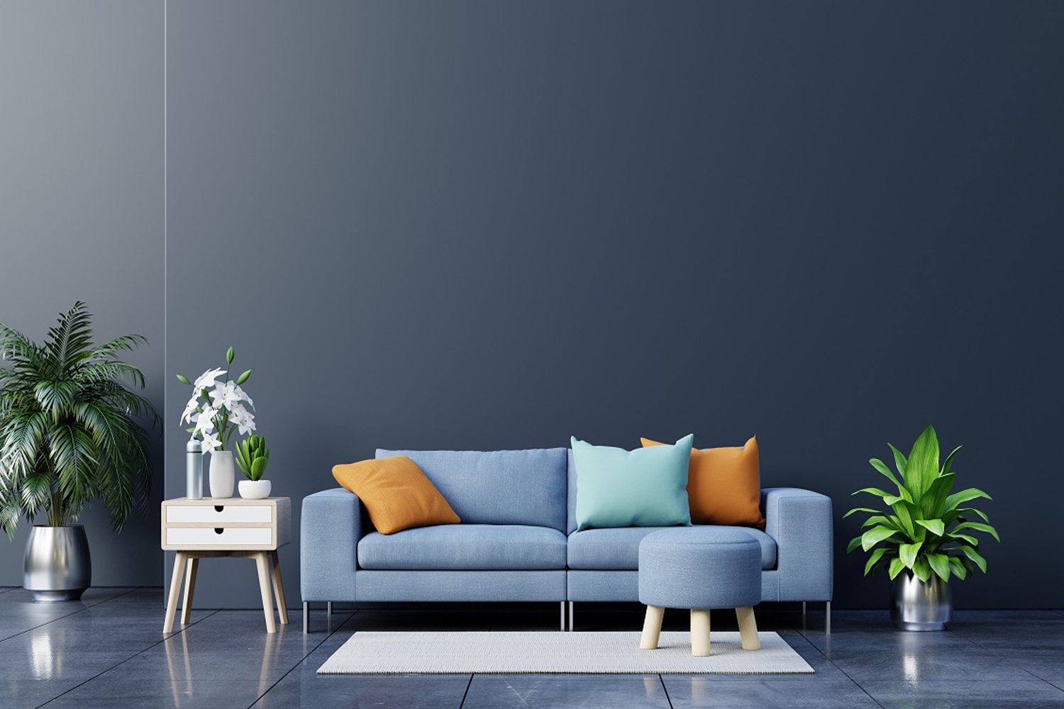
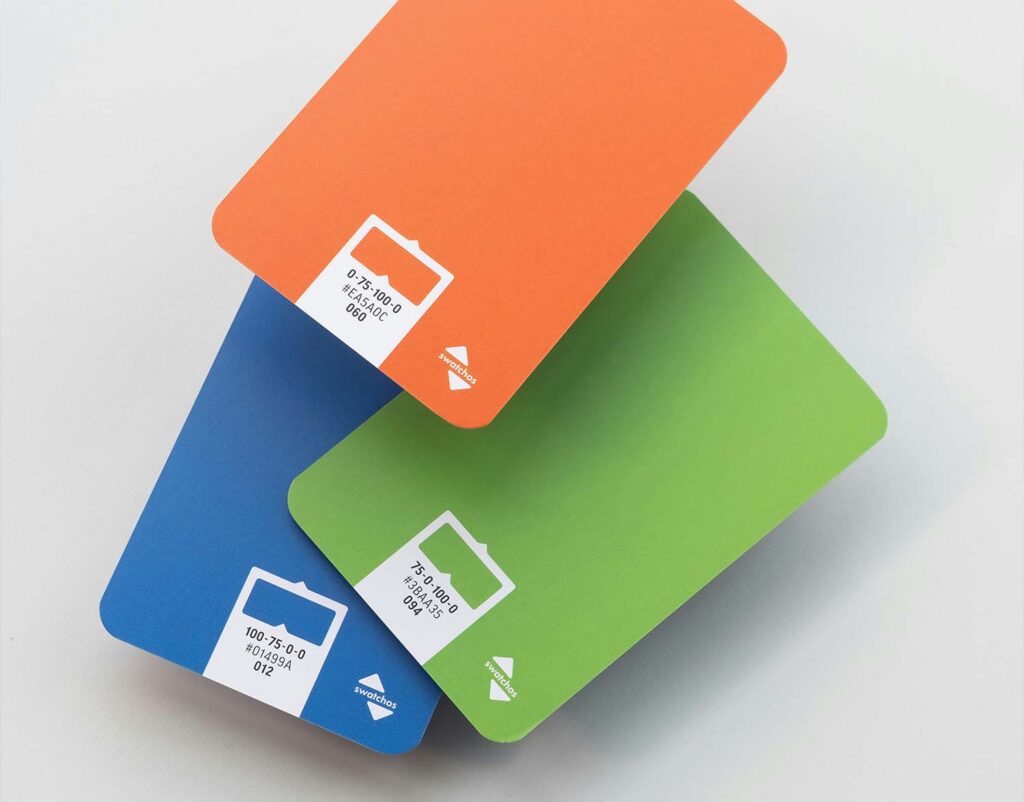
On the other hand, cool colors such as blue, green, and purple are associated with calmness, trust, and relaxation. Blue is widely used in corporate branding because it conveys reliability, professionalism, and serenity. Green evokes nature, growth, and health, making it a popular choice for eco-friendly products and wellness-related designs. Purple often represents luxury, creativity, and sophistication, commonly used in high-end branding or artistic contexts. Designers carefully choose these colors to align with the intended emotional response of their audience.
Neutrals, including black, white, gray, and beige, play a unique role in design by balancing or accentuating other colors. White represents simplicity, cleanliness, and minimalism, while black conveys elegance, power, and sophistication. Gray provides neutrality and balance, allowing other colors to stand out without overwhelming the viewer. Beige and other muted tones often create warmth and subtlety, contributing to a calm and comfortable design environment.
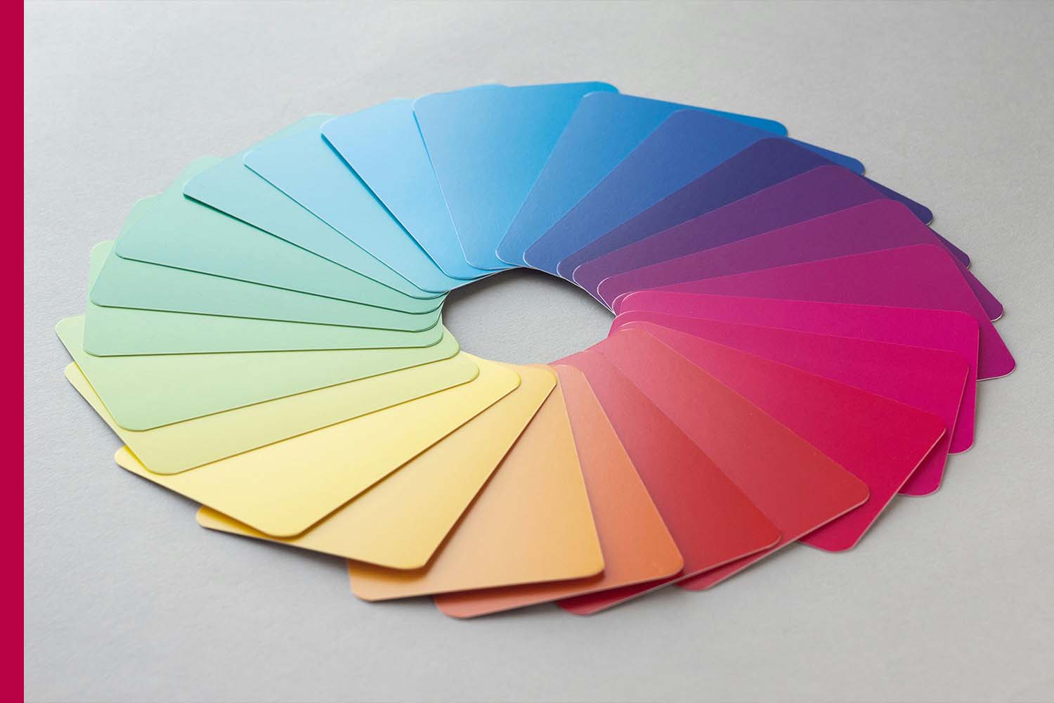
The combination of colors also impacts mood and perception. Complementary colors, placed opposite each other on the color wheel, create contrast and draw attention, making designs visually striking. Analogous colors, located next to each other, produce harmony and cohesion, ideal for soothing and consistent designs. The choice of color combinations can influence not only aesthetics but also user behavior, such as encouraging purchases, clicks, or engagement on digital platforms.
Cultural context is another factor in how colors affect emotions. While red symbolizes passion and energy in many Western cultures, it represents luck and prosperity in some Asian cultures. Designers must be mindful of cultural interpretations to ensure the intended emotional impact resonates globally.
Modern design also leverages color to improve usability and accessibility. High-contrast color schemes enhance readability, while softer palettes reduce visual fatigue and promote comfort. User experience designers often conduct testing to ensure that color choices evoke the desired mood and emotional response while remaining functional for all users, including those with color vision deficiencies.
In conclusion, colors are far more than aesthetic choices in design—they are powerful emotional tools. By understanding the psychology of color, designers can influence moods, shape perceptions, and create experiences that resonate deeply with audiences. Thoughtful use of color not only enhances visual appeal but also builds connection, engagement, and meaning in every design project. Whether through bold, vibrant tones or subtle, calming hues, the right colors have the power to transform how people feel and interact with the world around them.