


Frutiger Aero is a distinctive digital design aesthetic that evokes strong feelings of nostalgia for the early 2000s, a time when technology felt fresh, optimistic, and full of promise. Often associated with the rise of personal computers, early smartphones, and modern operating systems, Frutiger Aero represents a period when designers aimed to make digital interfaces feel friendly, immersive, and visually rich. Although the term “Frutiger Aero” was coined years later, the style itself was widely present in software design, advertising, websites, and product visuals during that era.
The aesthetic takes its name from two major influences: the Frutiger typeface, known for its clean and human-centered readability, and Windows Aero, the glossy interface style introduced by Microsoft. Together, they symbolize a design philosophy focused on clarity, realism, and emotional comfort. Frutiger Aero visuals are instantly recognizable due to their shiny gradients, glass-like transparency, soft lighting effects, and smooth, rounded shapes. Interfaces often appeared almost three-dimensional, giving users the impression that digital elements were tangible and interactive rather than flat and abstract.
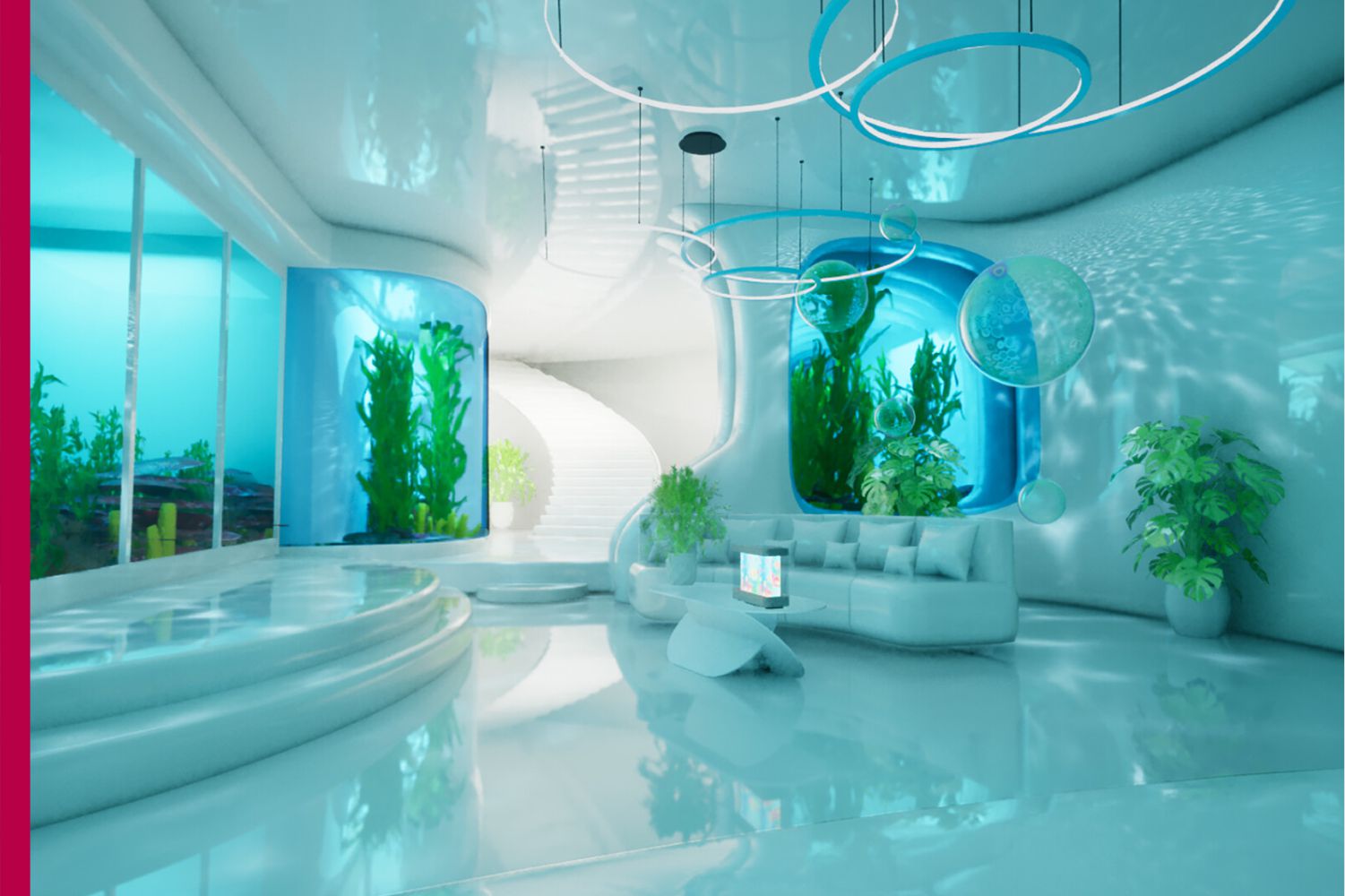
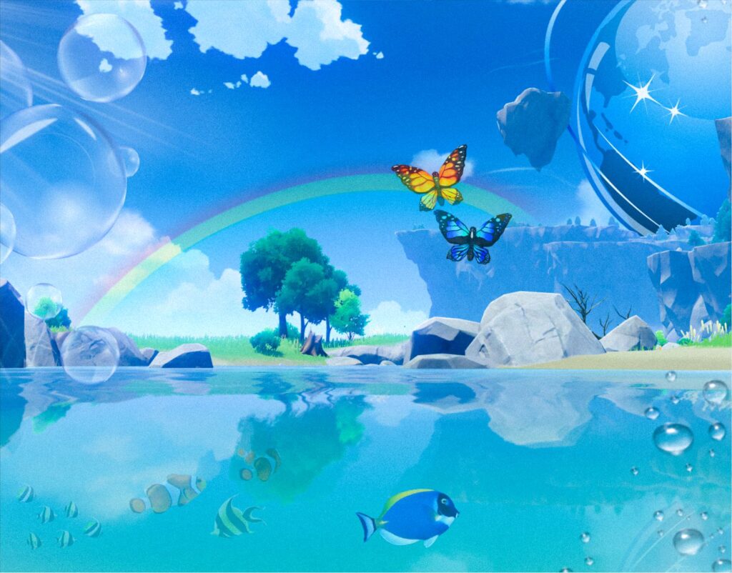
Nature plays a significant role in Frutiger Aero imagery. Skies filled with clouds, green fields, flowing water, bubbles, leaves, and sunlight were frequently combined with technological elements. This fusion suggested a hopeful harmony between technology and the natural world, reflecting a belief that innovation could improve everyday life without feeling cold or mechanical. Bright blues, greens, and whites dominated the color palette, creating a clean and uplifting atmosphere that felt futuristic yet approachable.
Another defining feature of Frutiger Aero is skeuomorphism, a design approach where digital elements resemble real-world objects. Buttons looked like physical buttons, sliders resembled real controls, and icons often mimicked familiar items such as cameras, folders, or notepads. This helped users, many of whom were still adapting to digital environments, feel more comfortable navigating new technologies. The goal was not just functionality but emotional connection and ease of use.
As technology evolved, Frutiger Aero gradually faded from mainstream design. Around the early 2010s, flat design became dominant, prioritizing simplicity, speed, and minimal visual elements. While flat design improved efficiency across devices, many felt it lacked the warmth and personality that earlier aesthetics offered. This shift caused Frutiger Aero to be seen as outdated for a time, associated with older software and operating systems.
In recent years, however, Frutiger Aero has experienced a revival, particularly among younger generations discovering it through social media, digital art, and aesthetic communities. For many, it represents a more optimistic digital era, free from constant notifications, algorithm-driven content, and visual minimalism. Artists and designers now revisit this style as a form of creative expression and nostalgia, reimagining it in wallpapers, posters, animations, and experimental interfaces.
Frutiger Aero remains an important chapter in design history. It reminds us that digital aesthetics are shaped not only by technology but also by emotion, culture, and the hopes of a generation. Even today, its glossy skies and luminous interfaces continue to inspire those who long for a more expressive and human-centered digital world.